Monday, June 20, 2011

Ribbon customization - Part 8

In this post, I am going to show you how to add fly out anchor in the ribbon control. Here is the complete XML and following is the output. But first if you have not gone through part 1 to part 7, I would recommend you reading them first and then continue reading from here.

All we need to change in the XML that we used in earlier post is the controls section. Here we will take flyout control and populates that controls with its own menu items. Flyout anchor has got Menu tag first, that contains menu section tag, which contains controls section.

In this XML, I have used built in templates like o1 and o2.

<?xml version="1.0" encoding="utf-8"?>
<Elements xmlns="http://schemas.microsoft.com/sharepoint/">
<CustomAction Id="SPKings.Ribbon.CustomTab"
Location="CommandUI.Ribbon.ListView"
RegistrationId="100" RegistrationType="List">
<CommandUIExtension>
<CommandUIDefinitions>
<CommandUIDefinition
Location="Ribbon.ListItem.Groups._children">

<Group
Id="SPKings.Ribbon.CustomTab.SearchGroup"
Description="Different Search Engines"
Title="Search Engines"
Sequence="52"
Template="SearchEnginesGroup">


<Controls Id="SPKings.Ribbon.CustomTab.SearchGroup.Controls">

<FlyoutAnchor Id="SPKings.Ribbon.CustomTab.SearchGroup.FlyoutAnchor"
Sequence="10"
Image16by16="/_layouts/images/CustomImages/Search16.png"
Image32by32="/_layouts/images/CustomImages/Search32.jpg"
LabelText="Search Providers"
TemplateAlias="Search"
ToolTipTitle="Search Engines"
ToolTipDescription="This flyout anchor allowes you the choose search engines">

<Menu Id="Ribbon.Library.Share.FlyoutAnchor.Menu">

<MenuSection Id="Ribbon.Library.Share.FlyoutAnchor.Menu.MenuSection" Sequence="10" DisplayMode="Menu16">

<Controls Id="Ribbon.Library.Share.FlyoutAnchor.Menu.MenuSection.Controls">

<Button

Id="Ribbon.Library.Share.FlyoutAnchor.Menu.MenuSection.GoogleButton"

Sequence="10"

Command="GoogleButtonCommand"

LabelText="Google"

Image16by16="/_layouts/images/CustomImages/google-logo.png"

TemplateAlias="o2"

/>

</Controls>

</MenuSection>


<MenuSection Id="Ribbon.Library.Share.FlyoutAnchor.Menu.MenuSection1" Sequence="20" DisplayMode="Menu16">

<Controls Id="Ribbon.Library.FlyoutAnchor.Menu.MenuSection1.Controls">
<Button Id="Ribbon.Library.FlyoutAnchor.Menu.MenuSection1.BingButton"

Sequence="10"

Command="BingButtonCommand"

LabelText="Bing"

Image16by16="/_layouts/images/CustomImages/Bing-logo.jpg"

TemplateAlias="o3"

/>

</Controls>

</MenuSection>

</Menu>


</FlyoutAnchor >

</Controls>

</Group>

</CommandUIDefinition>

<CommandUIDefinition
Location="Ribbon.Templates._children">

<GroupTemplate Id="SearchEnginesGroup">
<Layout Title="OneLarge" LayoutTitle="OneLarge">
<Section Alignment="Top" Type="OneRow">
<Row>
<ControlRef DisplayMode="Large" TemplateAlias="Search" />
</Row>
</Section>
</Layout>
</GroupTemplate>


</CommandUIDefinition>


<CommandUIDefinition Location="Ribbon.ListItem.Scaling._children">
<MaxSize Id="Ribbon.ListItem.Scaling.MaxSize" Sequence="35" GroupId="SPKings.Ribbon.CustomTab.SearchGroup" Size="OneLarge"/>
</CommandUIDefinition>

</CommandUIDefinitions>

<CommandUIHandlers>

<CommandUIHandler

Command="BingButtonCommand"

CommandAction="javascript:alert('Hi, you clicked Bing');" />

<CommandUIHandler

Command="GoogleButtonCommand"

CommandAction="javascript:alert('Hi, you clicked Google');" />


</CommandUIHandlers>

</CommandUIExtension>

</CustomAction>
</Elements>


And this is the output when you deploy this and activate as feature


Keep reading Part 9 for further exploration.

Friday, June 17, 2011

Hiding sign in as a different user option

sometimes we want to hide the option to allow user to log in with different user. We can have our custom master page applied to site and then we would like to place this in the web part in master page in 2010. or if you want that option not be available in certain page, then add content editor web part and use below code to hide it.


<script src="jquery-1.4.2.min.js" type="text/javascript"></script>

<script type="text/JavaScript">

jQuery(document).ready(function($) {

var objects = document.getElementsByTagName("ie:menuitem");

for (var i = 0; i < objects.length; i++) {

itm = objects[i];

if (('#' + itm.id).indexOf("LoginAsDifferentUser") != -1) {

$('#' + itm.id).remove();

}

}

})

</script>

You should be good to go.


Thursday, June 16, 2011

Ribbon customization - Part 7


In this post, we are going to cover a small change to our existing XML from the last part. If you have not gone through Part 1 to Part 6part 6, I recommend you read them first and then continue reading from here.

Let us talk more about tabs in the ribbon. We have seen how to create tab and add groups and controls to it. But what we have not discussed it, where all places you can add tab. You can add tab individually. This is what we have done. Below image shows adding individual tab in the ribbon.


Now what we are going to do is add this existing tab in the existing built in list tab. You will come to know when you make a small change in the XML that we took in our last post.

<CustomAction    Id="SPKings.Ribbon.CustomTab"
                   Location="CommandUI.Ribbon" Sequence="401" RegistrationId="100" RegistrationType="List" GroupId="ListContextualGroup">


<CommandUIDefinition
          Location="Ribbon.ListContextualGroup._children">

What we have done here is we have given the existing groupID as ListContextualGroup, that means we want to add our tab in the existing list tools contextual tab. And we have also changed the RegistraionID to 100 which is list not the library.

When changing the UIDefinition, we have mentioned that we want to add tab in the existing ListcontextualGroup.

And here is what we get after making these small two lines change.


As you can see our Utilities tab is now under existing list tools contextual tab. Keep reading Part-8 of this series.


Wednesday, June 15, 2011

Ribbon customization Part 6


Now let’s move on with the series and we will take the same example that we took in our last post which was part 5. If you have not gone through thePart-1 to Part-5, I would recommend you 
reading them first and then continue reading from here.

We are going to add one more group to our tab which is mail service and we are going to change layout of existing group which we used earlier to have three rows to occupy space for three search providers.

I am going to take the same example which I took in part 5; the only thing that I have added here is new group and new template. You can check it for yourself. I have added mail service group with one single row and two large size buttons. Rest everything is same and I have shown the output followed by the entire XML.

<?xml version="1.0" encoding="utf-8"?><Elements xmlns="http://schemas.microsoft.com/sharepoint/">  <CustomAction    Id="SPKings.Ribbon.CustomTab"                   Location="CommandUI.Ribbon" RegistrationType="List" RegistrationId="101">    <CommandUIExtension>      <CommandUIDefinitions>        <CommandUIDefinition          Location="Ribbon.Tabs._children">
          <Tab Id="SPKings.Ribbon.CustomTab"               Title="Utilities"               Description="Different Utilities comes here"               Sequence="1501">

            <Scaling Id="SPKings.Ribbon.CustomTab.Scaling">
              <MaxSize Id="SPKings.Ribbon.CustomTab.SearchGroup.MaxSize"                       GroupId="SPKings.Ribbon.CustomTab.SearchGroup"                       Size="ThreeMedium"/>
              <MaxSize Id="SPKings.Ribbon.CustomTab.MailGroup.MaxSize"                     GroupId="SPKings.Ribbon.CustomTab.MailGroup"                     Size="TwoLarge"/>
              <Scale Id="SPKings.Ribbon.CustomTab.SearchGroup.Scaling.CustomTabScaling"                     GroupId="SPKings.Ribbon.CustomTab.SearchGroup"                     Size="ThreeMedium" />
              <Scale Id="SPKings.Ribbon.CustomTab.SearchGroup.MailGroup.CustomTabScaling"                     GroupId="SPKings.Ribbon.CustomTab.MailGroup"                     Size="TwoLarge" />
            </Scaling>
            <Groups Id="SPKings.Ribbon.CustomTab.Groups">
              <Group                Id="SPKings.Ribbon.CustomTab.SearchGroup"                Description="Different Search Engines"                Title="Search Engines"                Sequence="52"                Template="SearchEnginesGroup">

                <Controls Id="SPKings.Ribbon.CustomTab.SearchGroup.Controls">
                  <Button                    Id="SPKings.Ribbon.CustomTab.SearchGroup.SearchBingButton"                    Sequence="15" Image16by16="/_layouts/images/CustomImages/Bing-logo.jpg"                    Image32by32="/_layouts/images/CustomImages/bing.png"                    Description="Click to see Bing message"                    Command="btnGoToBingCommand"                    LabelText="Bing"                    TemplateAlias="BingSearch" />
                  <Button                 Id="SPKings.Ribbon.CustomTab.SearchGroup.SearchGoogleButton"                 Sequence="15" Image16by16="/_layouts/images/CustomImages/google-logo.png"                 Image32by32="/_layouts/images/CustomImages/google_logo.jpg"                 Description="Click to see google message"                 Command="btnGoToGoogleCommand"                 LabelText="Google"                 TemplateAlias="GoogleSearch" />
                  <Button                 Id="SPKings.Ribbon.CustomTab.SearchGroup.SearchYahooButton"                 Sequence="15" Image16by16="/_layouts/images/CustomImages/yahoo.png"                 Image32by32="/_layouts/images/CustomImages/yahoo 32.png"                 Description="Click to see Yahoo message"                 Command="btnGoToYahooCommand"                 LabelText="Yahoo"                 TemplateAlias="YahooSearch" />                                  </Controls>
              </Group>
              <Group                Id="SPKings.Ribbon.CustomTab.MailGroup"                Description="Different Mail Services"                Title="Email services"                Sequence="54"                Template="MailServicesGroup">
                <Controls Id="SPKings.Ribbon.CustomTab.MailGroup.Controls">
                <Button                Id="SPKings.Ribbon.CustomTab.MailGroup.HotmailServiceButton"                Sequence="17" Image16by16="/_layouts/images/CustomImages/Hotmail16.bmp"                Image32by32="/_layouts/images/CustomImages/Hotmail32.bmp"                Description="Click to see Hotmail message"                Command="btnGoToHotmailCommand"                LabelText="Hotmail"                TemplateAlias="HotmailService" />
                  <Button              Id="SPKings.Ribbon.CustomTab.MailGroup.GmailServiceButton"              Sequence="17" Image16by16="/_layouts/images/CustomImages/gmail16.png"              Image32by32="/_layouts/images/CustomImages/gmail32.bmp"              Description="Click to see GMail message"              Command="btnGoToGMailCommand"              LabelText="GMail"              TemplateAlias="GMailService" />                                  </Controls >                              </Group >

            </Groups>          </Tab>        </CommandUIDefinition>
        <CommandUIDefinition          Location="Ribbon.Templates._children">
          <GroupTemplate Id="SearchEnginesGroup">            <Layout Title="ThreeMedium" LayoutTitle="ThreeMedium">              <Section Alignment="Top" Type="ThreeRow">                <Row>                  <ControlRef DisplayMode="Medium" TemplateAlias="BingSearch" />                </Row>                <Row>                  <ControlRef DisplayMode="Medium" TemplateAlias="GoogleSearch" />                </Row>                <Row>                  <ControlRef DisplayMode="Medium" TemplateAlias="YahooSearch" />                </Row>              </Section>            </Layout>          </GroupTemplate>

        </CommandUIDefinition>
        <CommandUIDefinition          Location="Ribbon.Templates._children">
          <GroupTemplate Id="MailServicesGroup">            <Layout Title="TwoLarge" LayoutTitle="TwoLarge">              <Section Alignment="Top" Type="OneRow">                <Row>                  <ControlRef DisplayMode="Large" TemplateAlias="HotmailService" />                                 <ControlRef DisplayMode="Large" TemplateAlias="GMailService" />                                                  </Row>              </Section>            </Layout>          </GroupTemplate>

        </CommandUIDefinition>
      </CommandUIDefinitions>
      <CommandUIHandlers>        <CommandUIHandler           Command="btnGoToBingCommand"           CommandAction="javascript: var BingID = SP.UI.Status.addStatus('This will take you to Bing search');           SP.UI.Status.setStatusPriColor(BingID, 'green');"></CommandUIHandler>                <CommandUIHandler   Command="btnGoToGoogleCommand"                                    CommandAction="javascript: var GoogleId = SP.UI.Status.addStatus('This will take you to Google search');           SP.UI.Status.setStatusPriColor(GoogleId, 'red');"></CommandUIHandler>
        <CommandUIHandler   Command="btnGoToYahooCommand"                                 CommandAction="javascript: var YahooID = SP.UI.Status.addStatus('This will take you to Yahoo search');           SP.UI.Status.setStatusPriColor(YahooID, 'blue');"></CommandUIHandler>
        <CommandUIHandler   Command="btnGoToGMailCommand"                               CommandAction="javascript: var GMailID = SP.UI.Status.addStatus('This will take you to GMail');           SP.UI.Status.setStatusPriColor(GMailID, 'blue');"></CommandUIHandler>
        <CommandUIHandler   Command="btnGoToHotmailCommand"                               CommandAction="javascript: var HotmailID = SP.UI.Status.addStatus('This will take you to Hotmail');           SP.UI.Status.setStatusPriColor(HotmailID, 'blue');"></CommandUIHandler>              </CommandUIHandlers >
    </CommandUIExtension>  </CustomAction></Elements>
and here is the output


Read further on Part 7


Tuesday, June 14, 2011

Ribbon customization Part 5

In this post, I am going to talk about how to add tab and then how to add groups and controls in it.

If you have not gone through Part 1 to Part 4, I recommend you reading them first and then continue reading this post.

First we will start with very basic example of how to add a simple tab and one group with one control. This will reduce the level of complexity and then we can dive into more examples.

So here is the example that I have used and following is the output of it. I am going to explain each important tag in detail. We have added one tab called Utilities and I have added one group for search with one button control for Bing search engine.

<blockquote><?xml version="1.0" encoding="utf-8"?>
<Elements xmlns="http://schemas.microsoft.com/sharepoint/">
<CustomAction Id="SPKings.Ribbon.CustomTab"
Location="CommandUI.Ribbon" RegistrationType="List" RegistrationId="101">
<CommandUIExtension>
<CommandUIDefinitions>
<CommandUIDefinition
Location="Ribbon.Tabs._children">

<Tab Id="SPKings.Ribbon.CustomTab"
Title="Utilities"
Description="Different Utilities comes here"
Sequence="501">


<Scaling Id="SPKings.Ribbon.CustomTab.Scaling">

<MaxSize Id="SPKings.Ribbon.CustomTab.SearchGroup.MaxSize"
GroupId="SPKings.Ribbon.CustomTab.SearchGroup"
Size="OneLarge"/>

<Scale Id="SPKings.Ribbon.CustomTab.SearchGroup.Scaling.CustomTabScaling"
GroupId="SPKings.Ribbon.CustomTab.SearchGroup"
Size="OneLarge" />

</Scaling>

<Groups Id="SPKings.Ribbon.CustomTab.Groups">

<Group
Id="SPKings.Ribbon.CustomTab.SearchGroup"
Description="Different Search Engines"
Title="Search Engines"
Sequence="52"
Template="SearchEnginesGroup">


<Controls Id="SPKings.Ribbon.CustomTab.SearchGroup.Controls">

<Button
Id="SPKings.Ribbon.CustomTab.SearchGroup.SearchBingButton"
Sequence="15" Image16by16="/_layouts/images/CustomImages/Bing-logo.jpg"
Image32by32="/_layouts/images/CustomImages/bing.png"
Description="Click to see Bing message"
Command="btnGoToBingCommand"
LabelText="Bing"
TemplateAlias="BingSearch" />

</Controls>

</Group>


</Groups>
</Tab>
</CommandUIDefinition>

<CommandUIDefinition
Location="Ribbon.Templates._children">

<GroupTemplate Id="SearchEnginesGroup">
<Layout Title="OneLarge" LayoutTitle="OneLarge">
<Section Alignment="Top" Type="OneRow">
<Row>
<ControlRef DisplayMode="Large" TemplateAlias="BingSearch" />
</Row>
</Section>
</Layout>
</GroupTemplate>


</CommandUIDefinition>

</CommandUIDefinitions>

<CommandUIHandlers>
<CommandUIHandler
Command="btnGoToBingCommand"
CommandAction="javascript: var statusId = SP.UI.Status.addStatus('This will take you to Bing search');
SP.UI.Status.setStatusPriColor(statusId, 'green');"></CommandUIHandler>

</CommandUIHandlers >

</CommandUIExtension>
</CustomAction>
</Elements></blockquote>


And here is what you get


Now, let’s understand important tags in above XML.

<CustomAction Id="SPKings.Ribbon.CustomTab"
Location="CommandUI.Ribbon" RegistrationType="List" RegistrationId="101">


We have defined that we want to add something in the ribbon which we have indicated with the help of CommandUI.Ribbon and we have mentioned that we want a new tab to be on the document library by using List registration type and ID.

<CommandUIDefinition
Location="Ribbon.Tabs._children">


Then we have shown that we want to add children in the tabs. That means we want to add one more tab in the existing list of tabs.

<Scaling Id="SPKings.Ribbon.CustomTab.Scaling">

<MaxSize Id="SPKings.Ribbon.CustomTab.SearchGroup.MaxSize"
GroupId="SPKings.Ribbon.CustomTab.SearchGroup"
Size="OneLarge"/>

<Scale Id="SPKings.Ribbon.CustomTab.SearchGroup.Scaling.CustomTabScaling"
GroupId="SPKings.Ribbon.CustomTab.SearchGroup"
Size="OneLarge" />

</Scaling>


Then we have defined scaling element. Scaling actually defines that how does a groups which are inside the tab scale based on the size of the window.

We have to make sure that we have to have N number of Maxsize and Scale element when we have N number of groups. As I have only one right now, I have one MaxSize and one Scale element. If you have three groups, then total will be six entries. Each MaxSize and Scale for each group.

Here we have mentioned in MaxSize and Scale that this refers to SearchGroup which we will have created in later part of XML. So this element is bound to that group. GroupID must be the same Id defined for the group.

<Group
Id="SPKings.Ribbon.CustomTab.SearchGroup"
Description="Different Search Engines"
Title="Search Engines"
Sequence="52"
Template="SearchEnginesGroup">


Now are adding groups to it. Here I have only one group, so it’s only one tag right now here we have given Id of the group, description, title and the sequence. These are self-explanatory part. Important attribute to note here is the template attribute. In earlier posts of this series, we used the built in template. Here we have defined our custom template. We can define our own layout and put controls inside that.

So we defined the layout later in xml. But as of now we need to give that template ID.

<Controls Id="SPKings.Ribbon.CustomTab.SearchGroup.Controls">

<Button
Id="SPKings.Ribbon.CustomTab.SearchGroup.SearchBingButton"
Sequence="15" Image16by16="/_layouts/images/CustomImages/Bing-logo.jpg"
Image32by32="/_layouts/images/CustomImages/bing.png"
Description="Click to see Bing message"
Command="btnGoToBingCommand"
LabelText="Bing"
TemplateAlias="BingSearch" />

</Controls>


Then in controls collection, we have defined one single button and set its attribute. Again how this button will render is based on the templatealias. That means when we define our custom layout we need to give alias to that template and mention here for the controls.

Till now we have added, controls into group, group into tabs. Now we need to define how they will appear. Hence we need to add templates to the ribbon now.

Declare another instance of UIDefinition. We have added now the template that we used earlier. We need to refer this template when using templateID given to the group. Now here what we want is because we have one single button, I would like to place it in a single row in a table. So just like how we use single TR element, in the same way I have defined one single table here its Section element and then single TR here its Row element and then referencing the button control here with the help of template alias. This means we want that button control to appear here. And we want that button to be displayed as a large control section.


<CommandUIHandlers>
<CommandUIHandler
Command="btnGoToBingCommand"
CommandAction="javascript: var statusId = SP.UI.Status.addStatus('This will take you to Bing search');
SP.UI.Status.setStatusPriColor(statusId, 'green');"></CommandUIHandler>

</CommandUIHandlers>

And after defining the template, we have defined the action that happens when button is clicked through the handlers. We have to give the command name which we mentioned in the button control and what happens when the button is clicked in the commandaction element.

Keep reading Part-6 to explore further.

Monday, June 13, 2011

Result is out

Finally the result is out

And I think people are okay with the Mango updates.

Friday, June 10, 2011

Remove all response from SharePoint survey

I just observed that there is no direct option to remove all responses from survey. Well I ran a survey in SharePoint and I got over 1000 response. Now when I went to remove all of them, there is no way in survey list. Not in Actions menu and nowhere else on the survey.

Also there is no Edit in datasheet option is available.

So, where did I go? I went to the content and structure from site settings and selected the list from left side and all responses appear on the right side. If you have many responses, I recommend change the number of items to 1000 instead of 100 on top right corner. Select all and then start removing.

I hope this helps.

Read Remove all survey response from web service

Tuesday, June 7, 2011

Ribbon customization - Part 4

Here we are back with part 4 and we are going to cover how to add new group in existing Tab. If you have not gone through Part 1 to Part 3, I would recommend you reading them in sequence and then come back and read from here.

We will create a group called Search Engines and then we will add it to existing tab for document library.

Here is a link for getting an idea of where all you can customize and use tag to customize it.

Default Server Ribbon Customization Locations

So first I would like to write down the entire XML and then would like to walk you through each and every important tag inside this XML. So here is the XML that I am going to use and then follow is the outcome of it.

<?xml version="1.0" encoding="utf-8"?>
<Elements xmlns="http://schemas.microsoft.com/sharepoint/">
<CustomAction Id="SPKings.Ribbon.NewGroupInExistingTab"
Location="CommandUI.Ribbon">
<CommandUIExtension>
<CommandUIDefinitions>
<CommandUIDefinition
Location="Ribbon.Library.Scaling._children">
<MaxSize Id="SPKings.Ribbon.NewGroupInExistingTab.SearchGroup.MaxSize"
Sequence="15"
GroupId="SPKings.Ribbon.NewGroupInExistingTab.SearchGroup"
Size="LargeMedium" />
</CommandUIDefinition>

<CommandUIDefinition
Location="Ribbon.Library.Groups._children">
<Group
Id="SPKings.Ribbon.NewGroupInExistingTab.SearchGroup"
Sequence="15"
Description="Different Search Engines"
Title="Search Engine Group"
Template="Ribbon.Templates.Flexible2">

<Controls
Id="SPKings.Ribbon.NewGroupInExistingTab.SearchGroup.Controls">
<Button
Id="SPKings.Ribbon.NewGroupInExistingTab.SearchGroup.SearchBingButton"
Sequence="15" Image16by16="/_layouts/images/CustomImages/Bing-logo.jpg"
Image32by32="/_layouts/images/CustomImages/bing.png"
Description="Click to see Bing message"
LabelText="Bing"
TemplateAlias="o1" />
</Controls>
</Group>
</CommandUIDefinition>
</CommandUIDefinitions>

</CommandUIExtension>
</CustomAction>
</Elements>


And here is the output


<CustomAction Id="SPKings.Ribbon.NewGroupInExistingTab"
Location="CommandUI.Ribbon">

This line tells that we want to add something to the ribbon first and we have given the ID of our new custom action that we want to perform.

<CommandUIDefinition
Location="Ribbon.Library.Scaling._children">

This line tells that we want to define UI in such a way that we are going to add a new group in the ribbon of library. We have documents and library, two tabs for document library. So we are directly telling that we will add a new group in the Library tab of documents library. _children means adding child, one more element to it and scale ribbon accordingly on the screen.

<MaxSize Id="SPKings.Ribbon.NewGroupInExistingTab.SearchGroup.MaxSize"
Sequence="15"
GroupId="SPKings.Ribbon.NewGroupInExistingTab.SearchGroup"
Size="LargeMedium" />

There are different maxsize elements available in SharePoint and appropriate size needs to be mentioned. You can have a lookat CMDUI.xml file under global xml folder in 14 hive. I recommend you go through that entire XML in details which will guide you complete understanding on how tabs, groups and controls are laid out in entire ribbon architecture.

We have defined sequence 15, because by default sequence is in the multiple of 10. If you observe CMDUI, then you would come to know that where do you want to add the group, so based on that you can set the sequence number. Based on the sequence number, it will appear on the ribbon.

Next we have defined GroupID, which is the ID which we will mention while we define Group in a moment.

<CommandUIDefinition
Location="Ribbon.Library.Groups._children">

Now we want to add groups, so we have indicated that _children, means we will now add a group to ribbon.

<Group
Id="SPKings.Ribbon.NewGroupInExistingTab.SearchGroup"
Sequence="15"
Description="Different Search Engines"
Title="Search Engine Group"
Template="Ribbon.Templates.Flexible2">


We have given the GroupID which we mention in location attribute earlier. Again sequence is the same where you want to place it. Other attributes are self-explanatory.

Important part is the Template. There are many built in templates available in CMDUI.xml file. You can observe them carefully. This is the best suite for our example to use built in template. We can define our own as well. We are going to see that in upcoming posts for this series. As of now we are using the built in flexible2 template.

<Controls
Id="SPKings.Ribbon.NewGroupInExistingTab.SearchGroup.Controls">
<Button
Id="SPKings.Ribbon.NewGroupInExistingTab.SearchGroup.SearchBingButton"
Sequence="15" Image16by16="/_layouts/images/CustomImages/Bing-logo.jpg"
Image32by32="/_layouts/images/CustomImages/bing.png"
Description="Click to see Bing message"
LabelText="Bing"
TemplateAlias="o1" />
</Controls>

Now we are adding the controls to the group and we are adding button control to it. There are different controls that we can place inside the group. We are going to see them in upcoming posts. Label, DropDown, ToggleButton etc.

We have given ID of the button, again sequence, then images for different size. TemplateAlias is another important attribute that you have to mention. We are using the built in Alias. Again this alias has to match with Template. Alias has to be defined in the Template that we have used in. in our case that is Flexible2. Again go through CMDUI.xml to understand it more.

We are done with this example, and next we are going to see a big picture which is how to add entire Tab and then groups and then controls to it. we will see with multiple groups and multiple controls inside it which will get you an idea about how to lay out different controls in group defined by our custom HTML table in template defined by us and not using default templates.

Read Part 5 for further reading.

Thursday, June 2, 2011

Ribbon customization - Part 3

SharePoint 2010 has come up with new framework with status bar and notification messages. Status bar is more for a persistent message and notification is more for showing temporary messages and then fads away.

We are going to see both in this post. We are going to take the same example which we took in last part 2. If you have not gone through Part 1 and Part 2, I would recommend you reading them first and then continue reading here.

Status bar messages are exposed via SP.UI.Status namespace.

To start with let me show you a very simple example.

Change the CommandAction to following.

<CommandUIHandler Command="BingButtonCommand" CommandAction="javascript:SP.UI.Status.addStatus('Hey this will take you to Bing');" />

Will result in


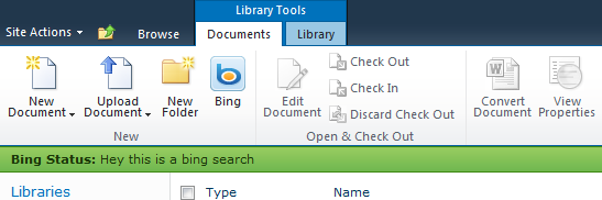
If you change it to this

<CommandUIHandler Command="BingButtonCommand" CommandAction="javascript:SP.UI.Status.addStatus('Bing Status:', 'Hey this is a bing search', true);" />

We have given name to the message. Then you will get this


Now a very important thing to note here is, when you add status to SharePoint 2010, it returns you one ID of that status so that you can play around with it. so to get the ID we need to write like this


<CommandUIHandler Command="BingButtonCommand"
CommandAction="javascript:var statusId =SP.UI.Status.addStatus('Bing Status:', 'Hey this is a bing search', true);" />

Here we have stored the ID of the status message in the statusId variable. So now let’s use it. change the CommandAction to this.


<CommandUIHandler Command="BingButtonCommand"
CommandAction="javascript:var statusId =SP.UI.Status.addStatus('Bing Status:', 'Hey this is a bing search', true);
SP.UI.Status.setStatusPriColor(statusId, 'green');" />

And this is what you get now


Okay, what if you keep clicking that Bing button, here is what happens.


That is because it is primarily meant to display a message and then remove it before showing the next message. This automatically goes away if you navigate to some other page and then come back to this page. But when you are on same page and keep clicking on the button, it displays the messages as many times as you display.

The idea is there may be a scenario where in you might want to display different messages with different colors for some reason. And for that, this completely suits it.

But in case you do not want this, then here is a way you can eliminate it.


<CommandUIHandler Command="BingButtonCommand"
CommandAction="javascript:SP.UI.Status.removeAllStatus(true);
var statusId =SP.UI.Status.addStatus('Bing Status:', 'Hey this is a bing search', true);
SP.UI.Status.setStatusPriColor(statusId, 'green');" />


We have added one more line to this, which actually removed all the messages from that status bar and hence even if you are on a same page and clicks on the button multiple times, it won’t display status that many times.

There is another way to remove a status by using its ID that we fetched earlier.

SP.UI.Status.removeStatus(statusId);

Now let’s take a look at notification framework. It is always a good way to say user that something is happening or something has just happened after they perform several task. For example when we save the data, we show to the user that data has been saved for about 3-4 seconds and then remove the message.

SharePoint 2010 has come up with this new framework which supports displaying message and then remove it which is called notifications.

So let’s make a small change in CommandAction to work like a notification.


<CommandUIHandler Command="BingButtonCommand"
CommandAction="javascript:SP.UI.Notify.addNotification('Something is in progress...');" />


You will notice a message coming up from right side of your screen and be there for about 7-8 seconds and then feds away.


Advantage is that you can also use entire HTML inside that and that gives you a flexibility to make font bold, italic, display tables, images etc in the message. Here is a simple example. Let’s change CommandAction to this.

<CommandUIHandler Command="BingButtonCommand"
CommandAction="javascript:SP.UI.Notify.addNotification('<b>Something </b> is in progress....');" />

Well this is the way it should not be written. It will not allow less than and greater than symbol to the script. So you need to encode it. we have written it just because it became simple for us. BUT YOU NEED TO ENCODE IN < AND > like And the output


Again when you add notification, you get the ID and then you can play with that Id.

The other overloaded methods that you can use with notification message are it also allows you to stick the message. Means it will always be there. Just pass one one more parameter which is true.

<CommandUIHandler Command="BingButtonCommand"
CommandAction="javascript:var NID=SP.UI.Notify.addNotification('&lt;b&gt;Something &lt;/b&gt; is in progress....',true);" />

You can also remove the message by using

SP.UI.Notify.removeNotification = function(NID) {
}

I hope this will help you all. Continue reading Part-4

Wednesday, June 1, 2011

Ribbon customization - Part 2

If you have not gone through Part 1, then I recommend you reading part 1 first and then continue reading here.

In this post, we are going to start with very basic stuff which is how to add a simple control in existing group and in existing tab.

Well, a very simple feature file with following XML will do that job for us. We are going to add a bing Search option in the list form of the document library.


<?xml version="1.0" encoding="utf-8"?>
<Elements xmlns="http://schemas.microsoft.com/sharepoint/">
<CustomAction Id="NewItemCustomization" Location="CommandUI.Ribbon" RegistrationId="101" RegistrationType="List" Title="New Item Customization">
<CommandUIExtension>
<CommandUIDefinitions>
<CommandUIDefinition Location="Ribbon.Documents.New.Controls._children">
<Button Id="BingButton" Image16by16="/_layouts/images/CustomImages/Bing-logo.jpg"
Image32by32="/_layouts/images/CustomImages/bing.png" Command="BingButtonCommand" Description="Go to Bing Search"
LabelText="Bing" TemplateAlias="o2" Sequence="81"/>
</CommandUIDefinition>
</CommandUIDefinitions>
<CommandUIHandlers>
<CommandUIHandler Command="BingButtonCommand" CommandAction="http://www.bing.com/" />
</CommandUIHandlers>
</CommandUIExtension>
</CustomAction>
</Elements>


Let’s understand what we have done here.

<CustomAction> - This indicates that we want to define some custom actions. We have given ID to define uniqueness. Then we defined the location. And we said that we want it in the ribbon. So we are customizing a ribbon. Then we said where we want that customization in ribbon. So we want it on the document library by specifying RegistraitonID as 101 and registrationtype as list. Then the Title of it which will not be visible in the UI.

<CommandUIExtension> - This defines that all UIdefinitions and handlers should come under this.
<CommandUIDefinitions> - In this we actually specify our all customizations to be done. All placements of the controls are to be done here. If there are multiple buttons at different places, then we should define here.

In the above example, we want to show Bing button in the document libraries New Tab. And hence we have specified Ribbon.Documents.New.Controls._children as location. _children means we are adding items to the controls collection in New Group of Documents Tab of document library.

Then we have defined that we want to display button. We can also display drop down for example. We will see it in upcoming posts. We have given the ID of course to the button. Then description and images both small and a large one. One very important part here is the command attribute which is actually implemented in CommandUIHandlers part. So you define command name in Definitions and implement that in UIhandlers. And that’s what we have done.

<CommandUIHandlers> - This is the place where we have to define what to do when button is clicked, or drop down item is selected. What actions to take. We have a button defined in Definitions part and when clicked BingButtonCommand triggers. Here we have defines what happens when this button is clicked which is taking user to Bing site. We defined this with the help of ComandAction.
So when you install this, this is what you get.


A very simple change in location would change the place where it displays.
<CommandUIDefinition Location="Ribbon.Documents.Manage.Controls._children">


Chanding the sequence number also changes the place where it displays.
<Button Id="BingButton" Image16by16="/_layouts/images/CustomImages/Bing-logo.jpg"
Image32by32="/_layouts/images/CustomImages/bing.png" Command="BingButtonCommand" Description="Go to Bing Search"
LabelText="Bing" TemplateAlias="o2" Sequence="31"/>


Let’s go just one step ahead and use simple alert javascript to prompt something when the button is clicked. Let’s change the command action.
<CommandUIHandler Command="BingButtonCommand" CommandAction="javascript:alert('Hey, this should actually take you to Bing search');" />


Continue reading Part 3


Share your SharePoint Experiences with us...
As good as the SharePointKings is, we want to make it even better. One of our most valuable sources of input for our Blog Posts comes from ever enthusiastic Visitors/Readers. We welcome every Visitor/Reader to contribute their experiences with SharePoint. It may be in the form of a code stub, snippet, any tips and trick or any crazy thing you have tried with SharePoint.
Send your Articles to sharepointkings@gmail.com with your Profile Summary. We will Post them. The idea is to act as a bridge between you Readers!!!

If anyone would like to have their advertisement posted on this blog, please send us the requirement details to sharepointkings@gmail.com